ourself.health:
onboarding redesign
My aim was to reduce drop-off and improve conversion rates by ensuring the onboarding experience is as considered and personal as the rest of the app.
Challenge
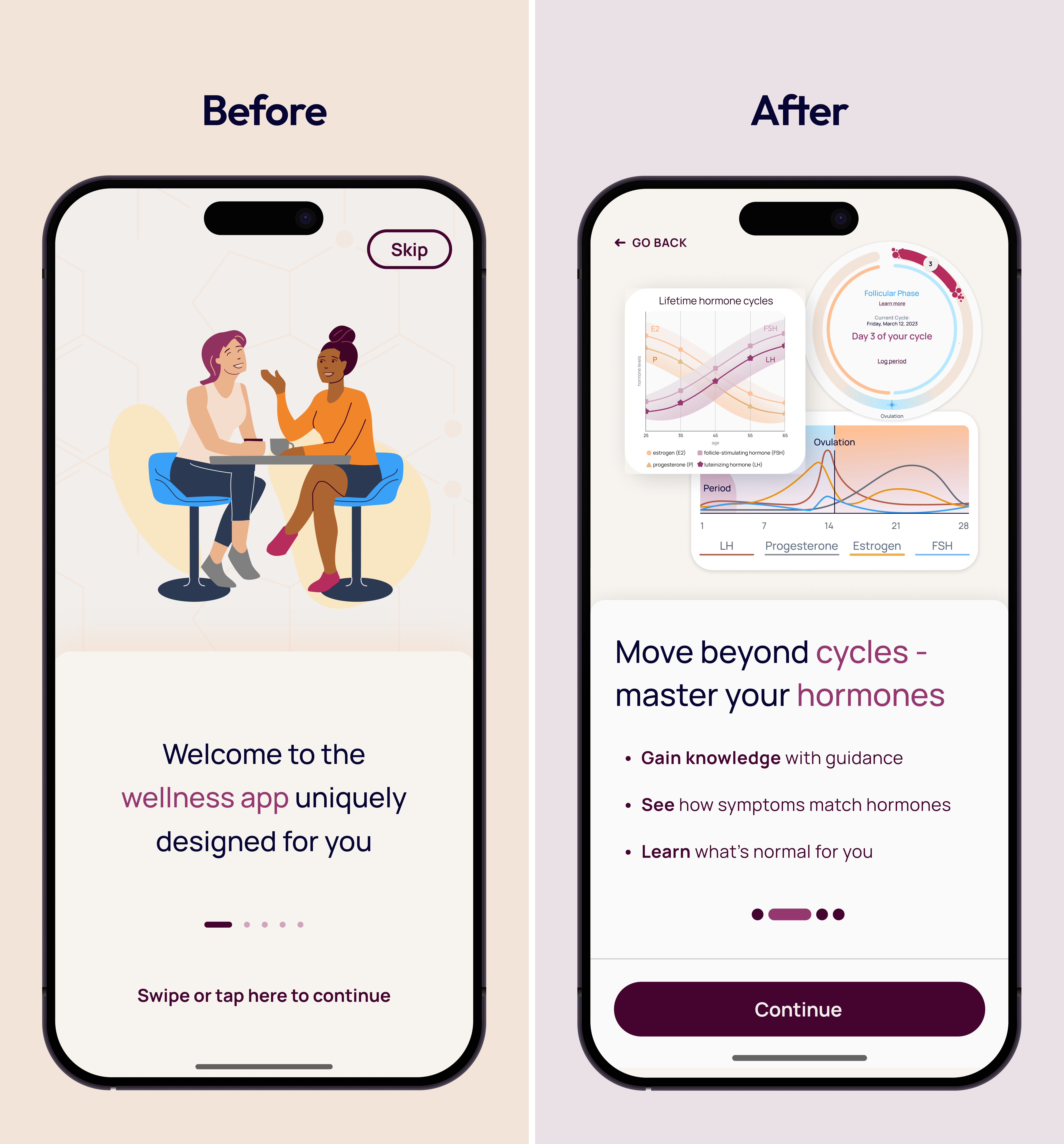
Ourself's product had grown significantly since its original onboarding was built. The product had evolved to include new features, an updated visual identity, and a clearer understanding of who the users were, but the onboarding flow hadn't grown with the rest of the app.
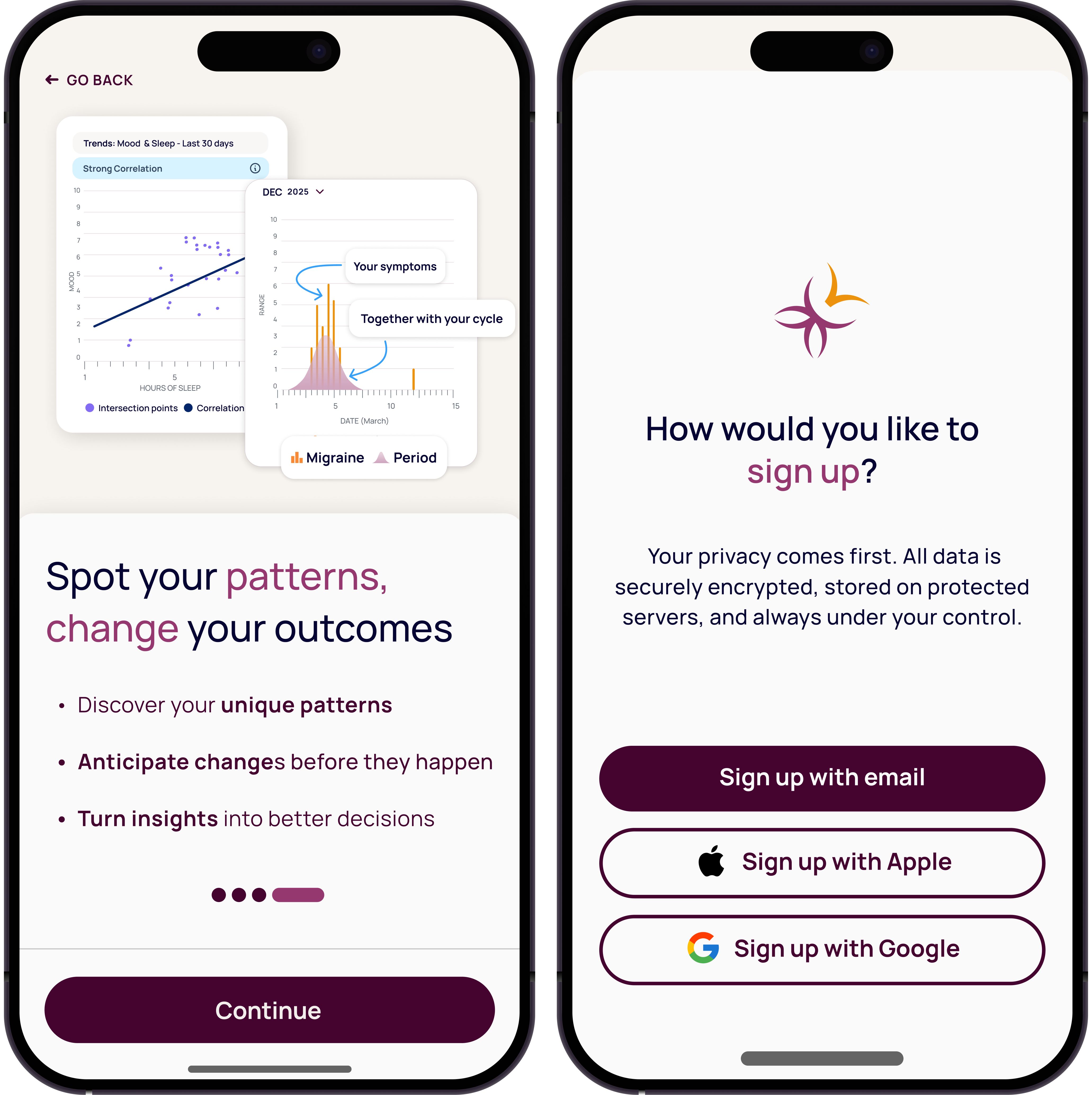
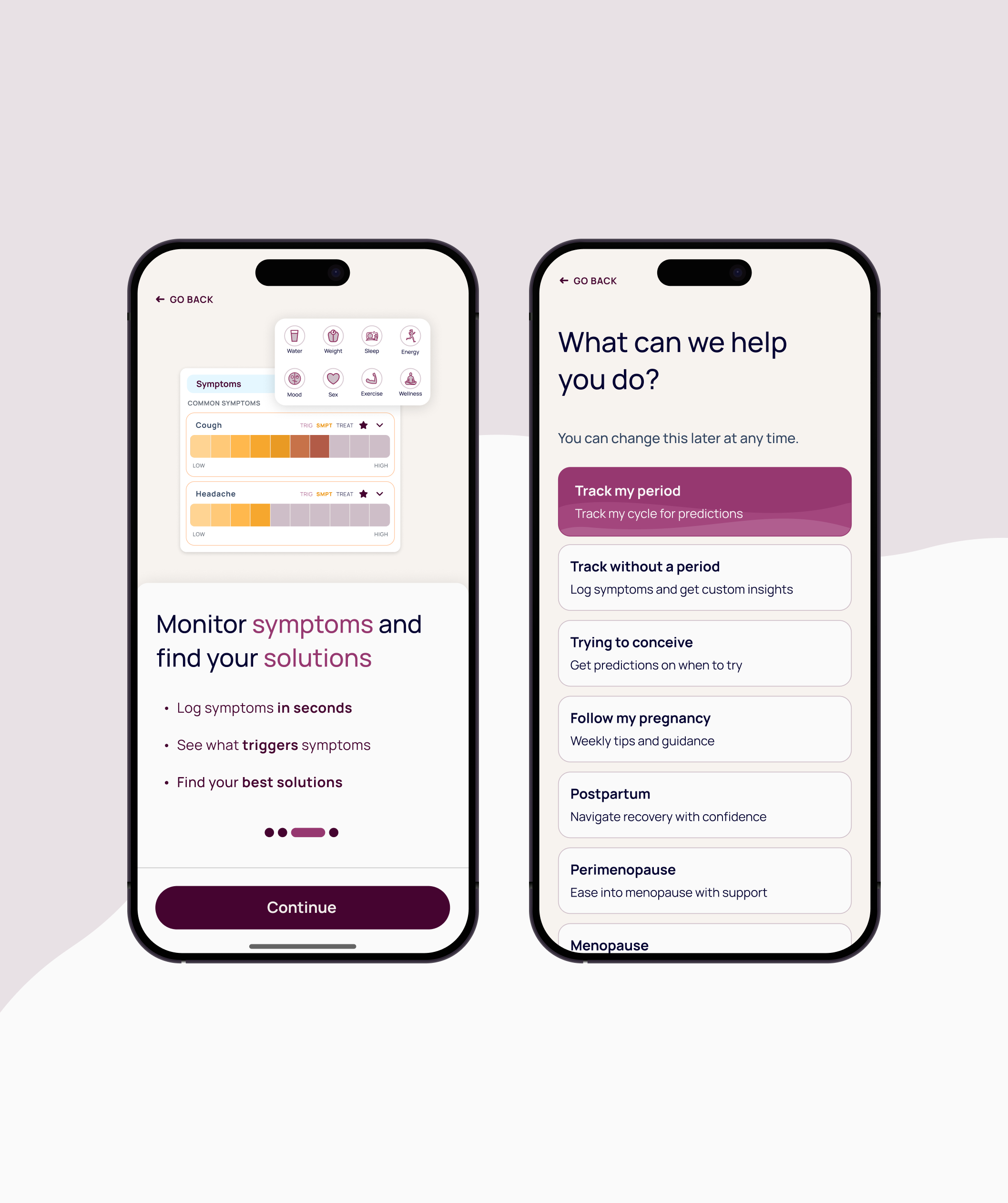
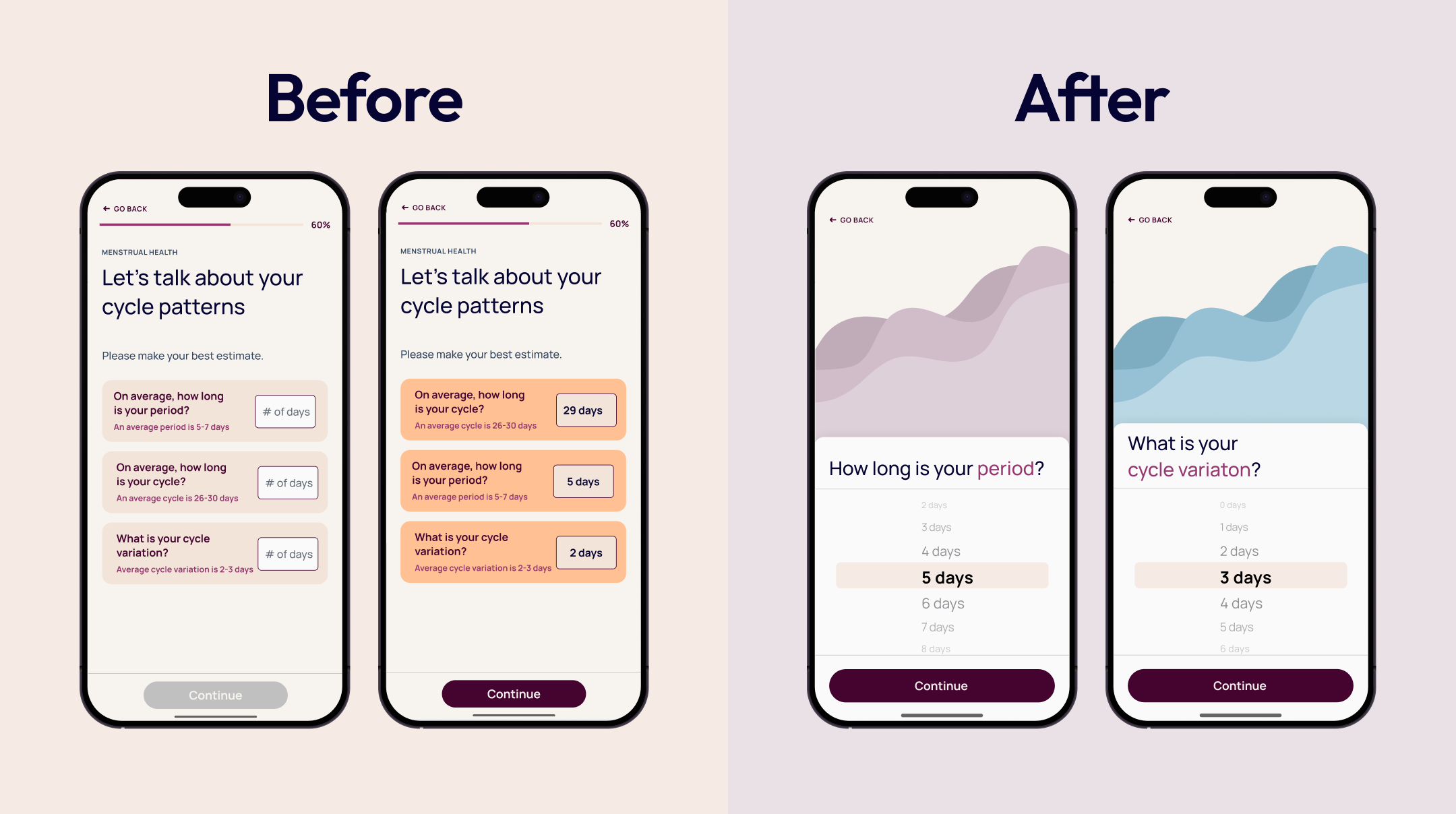
First-time users were arriving to an experience that felt misaligned with the rest of the product: too many steps, visually outdated, and with onboarding steps that were disjointed with the experience of the rest of the product. The result was drop-off. My goal was to refine the onboarding flow and update it in such a way that it communicates the core experience of the app to first-time users in the onboarding flow, and therefore increases conversion rates.
Process
I audited the app's current onboarding flow, completed a competitive analysis on the onboarding flows of competitors in a similar space, and worked closely with stakeholders to refine our shared goals for the onboarding experience.
With all of that in mind, I crafted UX for a new, more effective onboarding flow, and eventually created the UI for the flow after agreeing with the stakeholders that this flow was our best path forward.